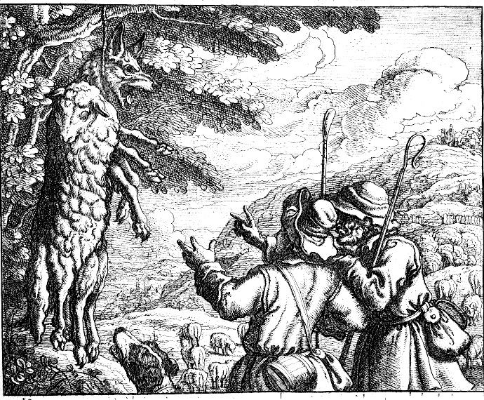


If you were born during the month of April, the daisy is your birth flower. Ancient Egyptians grew daisies for their medicinal value. Eating daisies was thought to relieve the pain of stomach ulcers and gout. King Henry VIII of England used them for that purpose. A Roman myth tells of Vertumnus, the god of seasons, gardens, and orchards, who saw Belides, the nymph protector of the forest, fell in love with her, and pursued her relentlessly. In desperation, she turned herself into a daisy. The daisy’s scientific name Bellis was derived from this story.
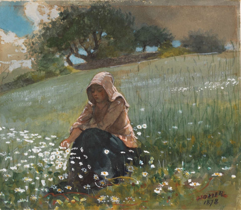
“Girl and Daisies” (1878) | Winslow Homer
The daisy is a symbol of innocence, purity, and true love. In “Girl and Daisies” (1878) (watercolor), by American artist Winslow Homer, a young woman sits among white daisies in a field on a sunny afternoon. Pensive, she reaches out to touch a daisy. No one is near, the day is calm, and her thoughts are her own. What is she thinking about? Homer invites the viewer to sit quietly with her among the flowers. The daisy is a composite flower, two flowers in one, in perfect harmony, representing true love. Perhaps that is what she ponders.
Homer painted “Girl and Daisies” shortly after the end of the Civil War. His focus at the time was on farms, fields, flowers, children, and other simple things. Americans were nostalgic for the pre-Civil War life. Homer had been on the front lines from 1861 until 1865, covering War for Harper’s New Monthly Magazine.
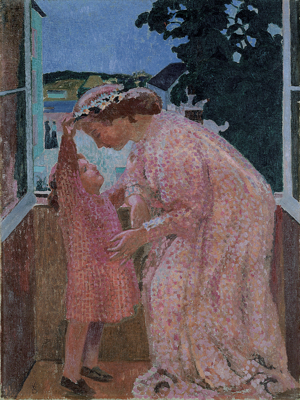
“The Crown of Daisies” (1905-06) | Maurice Denis (1870-1943)
“The Crown of Daisies” (1905-06) (29’’x22’’) was painted by French artist Maurice Denis (1870-1943), a member of the Nabi, a group of artists who wanted to make art in a style that combined both art and decoration. They were influenced by the Impressionists and Post-Impressionists. “The Crown of Daisies” is a depiction of a young married woman and her child, a simple subject drawn from everyday life, but painted in a highly decorative style. He uses Seurat’s pointillist technique to create the dresses of the two women, and parts of the background wall, window, and the houses visible through the window. The large leaves outside the window are painted in silhouette, and the very distant landscape and sky are rendered without dots. By mixing the decorative devices, Denis has created a charming painting.
In England, the daisy was called “day’s eye” because its petals close over the yellow center at night, and open as day beings. Young girls often wore crowns of daisies. Yellow daisies were symbols of joy, optimism, and friendship. Blue daisies represented loyalty, honesty, and trust. In Victorian flower symbolism the daisy could also mean “your secret is safe with me.” Daisies pop open in the sun: “Ups-a-daisy” was an expression said to children to encourage them to get up after they fell. “Oopsy daisy” and “whoops-a-daisy” were used when someone made a mistake, or tripped.
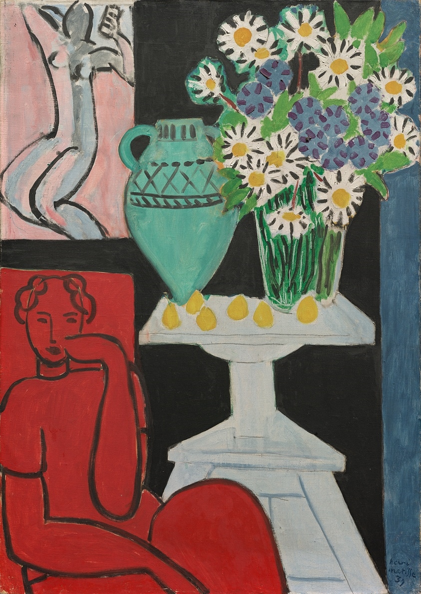
“Daisies” (1939) | Henri Matisse
Henri Matisse’s painting “Daisies” (1939) (36”x26”) presents a modern take on the daisy. The pose of the lady in red suggests innocence, although the color red traditionally conveys the opposite. The nude female’s position suggests physical love. The idea of innocence and true love, communicated by the white daisies, and the blue daisies message of loyalty and trust most likely were not on Matisse’s mind when he made the painting. The lemons on the table have two different interpretations; they represent longevity, purification, love, friendship, and have the power to foil negative energies and the evil eye. They also are symbolic of disappointment and bitterness. The green vase is a Greek amphora that was used to hold oil, wine, milk, or grain. Matisse’s “Daisies” is a sensuous painting.
“Daisies” was painted in 1939, months before the Nazi invasion of Paris. Paul Rosenberg, a prominent art dealer, was forced to flee France, leaving behind his large art collection. “Daisies” was among the paintings seized by the Nazis. Thanks to the United States Army, “Daisies” was recovered and returned to Rosenberg. He placed it in his new gallery in New York City.
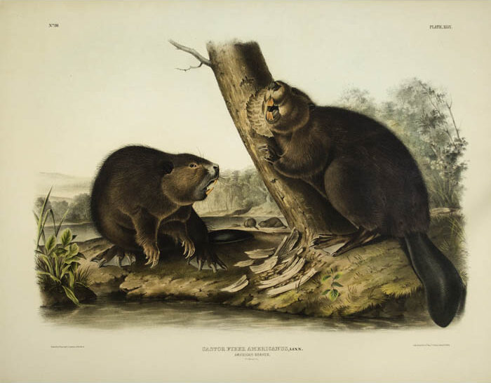
“American Beaver” (1844) | John James Audubon and his sons, published in Viviparous Quadrupeds of North America
If you were born between April 20 and May 20, your Native American totem animal is the beaver. “American Beaver” (1844) (21”x27”) was one of 150 lithographs by John James Audubon and his sons, published in Viviparous Quadrupeds of North America (1845-48). Beavers were observed to work hard, always in groups, to take care of the family, and to be determined to complete their work. For these reasons beavers were important animals in most Native American cultures for their persistence, perseverance, resourcefulness, and ability to adapt to situations. Several American Indian tribes had Beaver Clans, groups with matrilineal blood ties. Images of beavers were frequent on totem poles, masks, and on decorative objects worn on ceremonial occasions.
Audubon depicts two beavers communicating with each other by making sounds. They also communicated by slapping their tails. Audubon also has depicted the rich, thick fur coat that made the beaver a popular animal for trappers.
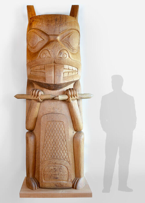
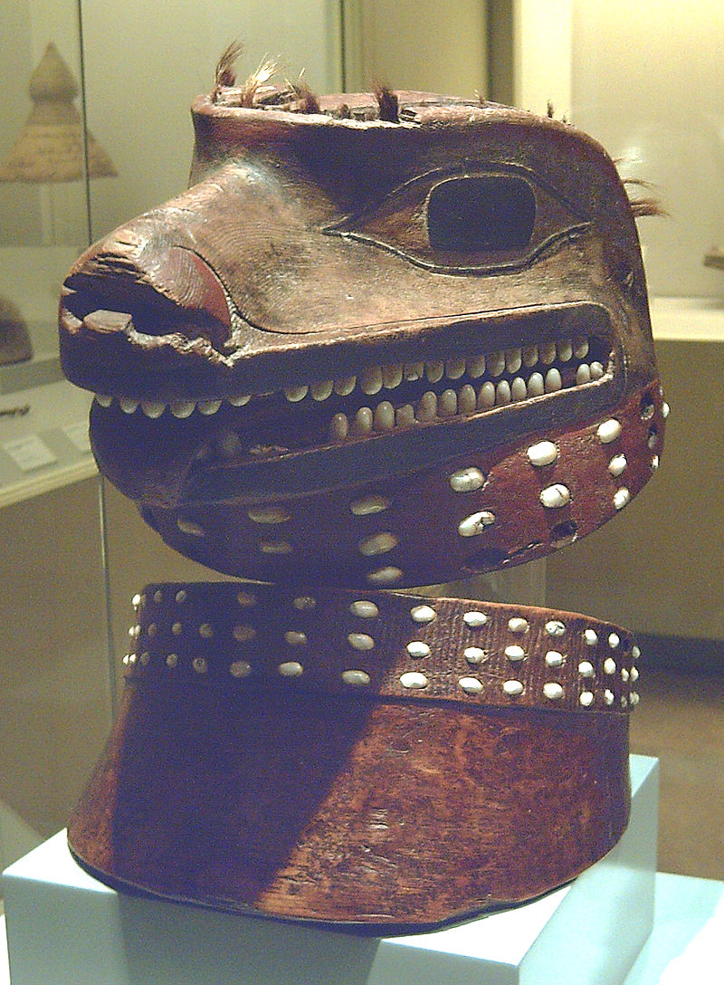
“Beaver Totem Pole” (1976) (9 feet) (red cedar) | Walter Harris (1931-2009).
“Beaver Totem Pole” (1976) (9 feet) (red cedar) was carved by Walter Harris (1931-2009). He was born in Kispiox, British Columbia. A wood carver, he attended the Gitanmaax School of Northwest Coast Indian Art in 1969, and he was a senior carving instructor at the school from 1972 until 1985. Harris’s image of the beaver follows the tradition of including large eyes, two very large front teeth, and both front legs raised with claws prominently displayed. In this work the claws hold pieces of wood. The beaver’s tail is decorated with a cross-hatch pattern.
Harris is the hereditary Chief of the Village of Kispiox, where he carved and raised a totem pole sometime during 1970’s. It was the first traditional totem pole raised in modern times. He considers totem poles are the heart of Native American Culture: “They are our deeds to the land. They serve as witnesses to the encounter of our ancestors with the supernatural beings who control all the fish, animals, and plants in our world. They are our charter of rights from time immemorial.”

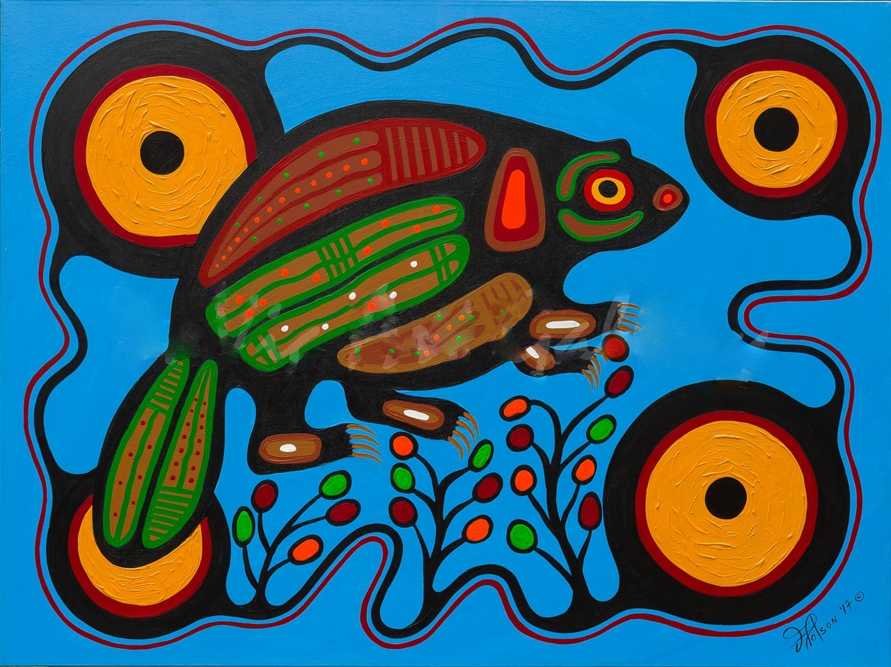
“Amik Beaver” (2017) (acrylic) | Frank Polson (b.1952)
“Amik Beaver” (2017) (acrylic) was painted by Frank Polson (b.1952), a member of the Algonquin Long Point First Nations community. Polson remembers working with his father on his trap lines. He remembers drawing beaver and moose. He dropped out of art school several times, was incarcerated for five years in a federal prison, and finally found art again. He used house paint and old jeans and bedsheets for his canvas. Visitors started buying his art. Inspired by the lessons of the Native American elders, and his childhood memories, he has become a respected artist, and has created over 2,700 paintings.
Polson’s “Amik Beaver” falls into the category of “Woodland” style. Polson said, “I’ve adopted my artistic heritage in a way that my elders would have never imagined, expressing my aesthetic, political, and social views in a range of styles and media.” His use of color is dynamic, and his lines are forceful, similar to those found in ancient totem poles, masks, costumes, jewelry, and objects used in rituals. Polson has emphasized the beaver’s flat tail and its sharp claws. He chooses images of North-Western Quebec’s wildlife, and adds images from legends, rituals, and nature with the intent to “build a bridge between cultures.”
The word amik in the Algonquin language means beaver. The beaver was the mascot of the 1976 Summer Olympics in Montreal.
Beverly Hall Smith was a professor of art history for 40 years. Since retiring with her husband Kurt to Chestertown in 2014, she has taught art history classes at WC-ALL. She is also an artist whose work is sometimes in exhibitions at Chestertown RiverArts and she paints sets for the Garfield Center for the Arts.